Case Study · Mobile App Design
Yost
A ride-sharing platform designed around transparency and flexibility, giving passengers real driver context and giving drivers a system that values their work. Built for users who need more than a standard trip.
Create transportation without limitations.
Most mobility platforms are optimized around standard transportation scenarios, leaving users with limited flexibility when needs become more specific. Yost was designed to create a broader transportation ecosystem where affordability, transparency, and vehicle diversity coexist within a simple experience.
Understanding the Mobility Gap
Yost started from a simple observation: most ride-sharing apps treat every trip the same way. Users with specific needs (business travel, large groups, accessible vehicles, or night safety) had no better option than standard platforms that were not designed for them. Our goal was to design around that gap.

Knowing Who Relies on Rides
Before designing a single screen, we mapped the competitive landscape, identified underserved user segments, traced friction-heavy moments in current booking flows, and defined the stories that would guide every design decision.
Mapping the Market
Existing platforms compete on speed and price, but none address transparency of earnings, flexible vehicle categories, and business-grade features simultaneously.
| Platform | Fare Transparency | Driver Earnings View | Service Variety | Business Mode | Loyalty Program |
|---|---|---|---|---|---|
| Uber | Partial | No | Yes | Yes | Partial |
| Lyft | Partial | No | Partial | No | Yes |
| Cabify | Partial | No | Partial | Yes | No |
| Bolt | No | No | Partial | No | No |
| Yost | Yes | Yes | Yes | Yes | Yes |
Who Depends on Rides
Four segments emerged with distinct needs and frustration points, each underserved by platforms that optimize only for the standard, solo commute.
28-45. Need advance booking, fixed fares, and professional receipts. Reliability is non-negotiable.
22-38. Cost-conscious and route-predictable. Loyalty and consistency drive platform choice.
30-55. Use rides for events, airports, or when their car is unavailable. Clarity and simplicity matter most.
18-28. Ride late and alone. Driver verification and real-time sharing with contacts are essential.
Designing for Real Riders
Three archetypes built from 18 user interviews and 210 survey responses, representing the core emotional and functional needs across segments.
"I need a driver who's on time and a fare that won't surprise my expense report."
"I want to see the fare before I book. Not a range. Just the number."
"I share my trip with my sister every time. I just want it to be easier to do that."
From Need to Destination
The current journey on competing platforms concentrates frustration at the fare and driver selection stages. Yost targets both moments directly.
- Step 01Trigger: Trip need arises
Meeting, airport, event, or late night. User opens the app with a specific context already in mind.
Purposeful - Step 02Select service: Category confusion
Standard platforms show one or two options with unclear differences. Users either guess or default to the cheapest.
Confused - Step 03Fare review: Surge pricing shock
Price shown at this stage often doesn't match expectations. Surge multipliers create mistrust and abandoned bookings.
Frustrated - Step 04Driver assigned: Limited profile info
Users see a name, a photo, and a rating average. No context about the driver's experience or specialties.
Uncertain - Step 05In-trip: No engagement layer
Ride takes place with no real connection. Feedback mechanisms exist but feel like obligation, not dialogue.
Passive - Step 06Post-ride: No retention loop
Yost redesigns this moment with a rewards layer and receipt summary that closes the loop and builds loyalty.
Rewarded
What Riders Actually Need
Distilled from persona research and journey mapping, these six stories defined the feature scope and design priorities for Yost's first version.
- US-01 As a business traveler, I want to book a ride in advance with a fixed confirmed fare, so I can budget accurately and arrive without stress.
- US-02 As a daily commuter, I want to see a clear breakdown of my fare before confirming, so I am never surprised by surge multipliers after the trip.
- US-03 As a passenger, I want to browse driver profiles that include verified ratings and trip specialties, so I can choose who I ride with confidently.
- US-04 As a safety-conscious rider, I want to share my real-time trip with a contact in one tap, so someone I trust always knows where I am.
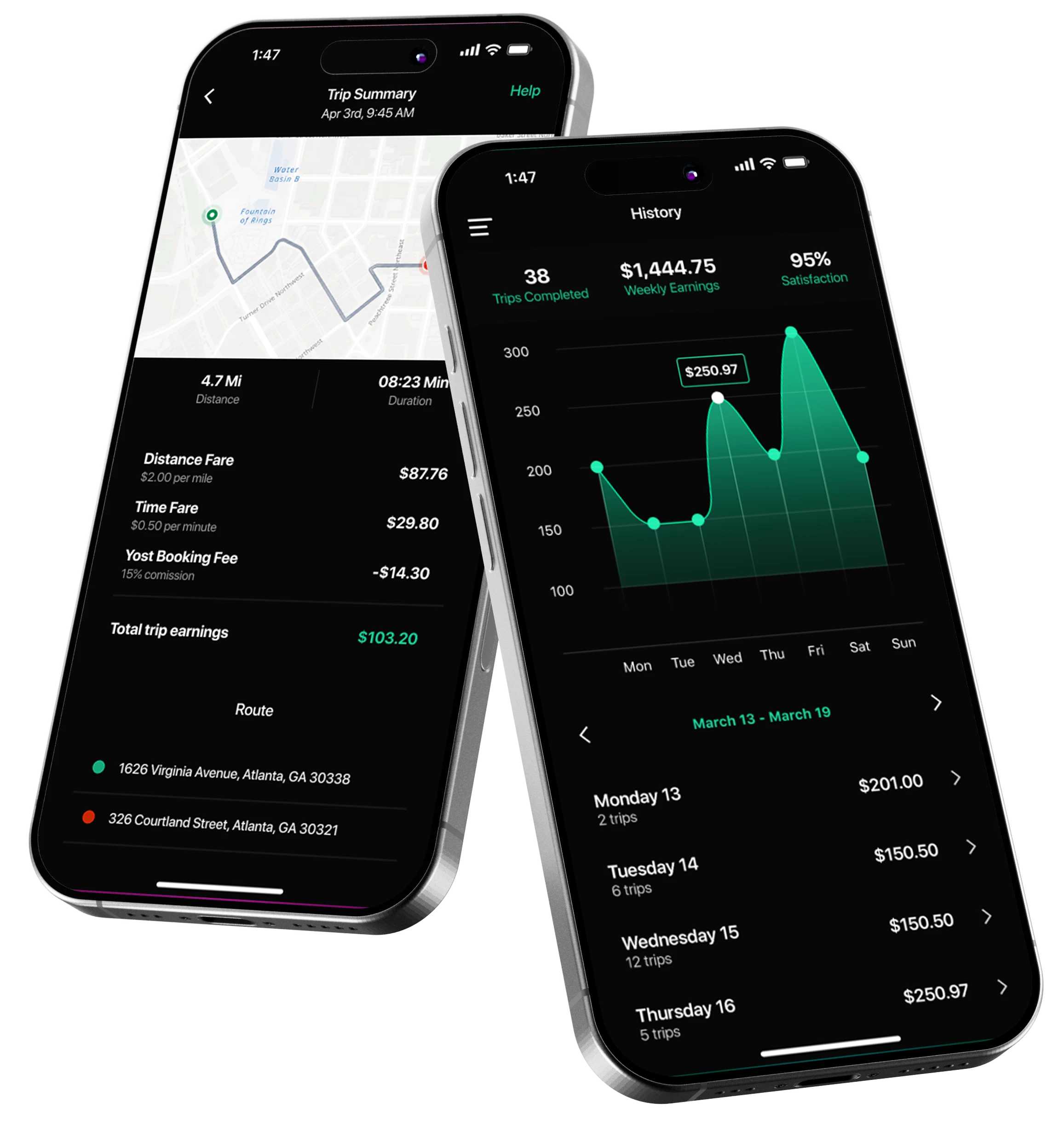
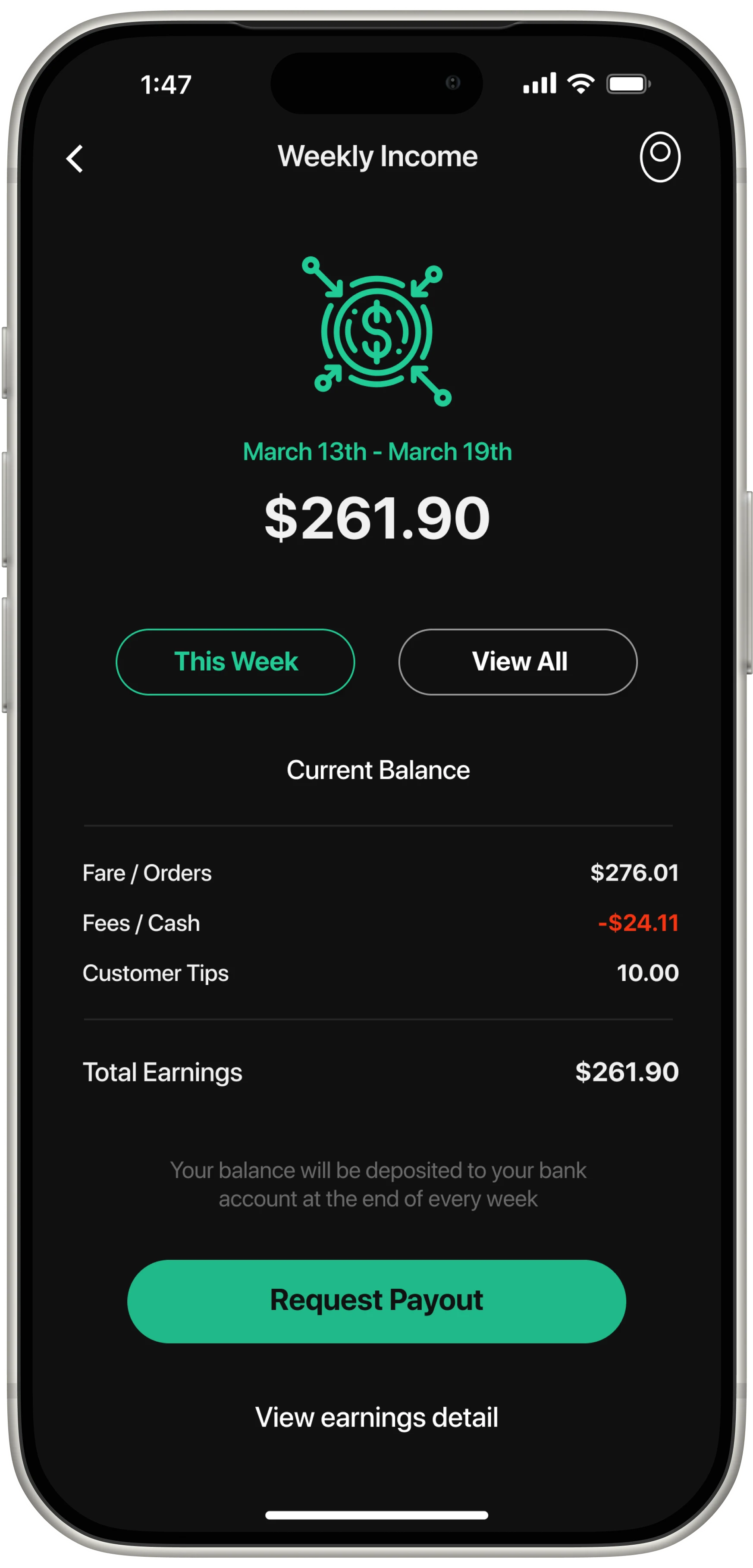
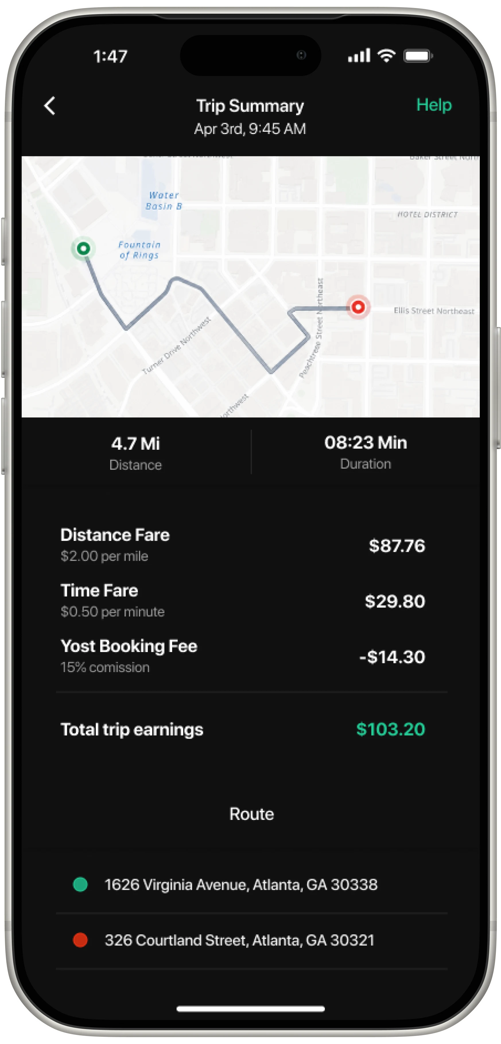
- US-05 As a driver-partner, I want to see my earnings in real time with a clear breakdown, so I understand my income and feel valued by the platform.
- US-06 As a frequent rider, I want to earn and redeem loyalty points across trips, so consistent use of Yost actually benefits me over time.
A System That Signals Motion and Trust
Yost's visual language needed to feel fast and dependable at the same time. The green communicates forward motion and eco-consciousness, the dark neutrals bring seriousness for the business segment, and Manrope keeps the whole system feeling native and frictionless.
(500) HEX #20CC98 Accessibility: 3.2:1 AA Large
(800) HEX #05A171 Accessibility: 4.6:1 AA
(Black) HEX #101010 Accessibility: 20.1:1 AAA
(BG 50) HEX #F5F7FA Accessibility: 18.5:1 AAA
Where We Landed
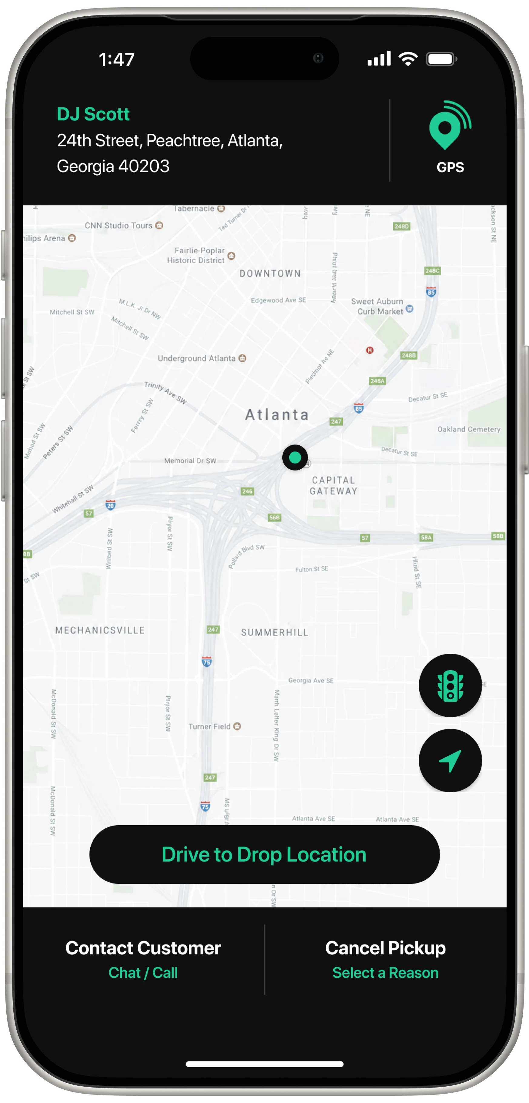
The central challenge was presenting a broad range of transportation options without increasing cognitive load. The final UI uses progressive disclosure, category-based filtering, and transparent fare breakdowns. Users stay in control without getting overwhelmed at every step.

Your product,
built right.
Yost showed that even a mature market like ride-sharing has room for design that puts people first. If you're building a product where trust is the foundation, let's talk.