Travel More
Travel More was built for people who believe spending money should take you somewhere. The team asked for a visual language that lived beyond the interface: editorial illustrations built to make you feel the pull of a new destination.
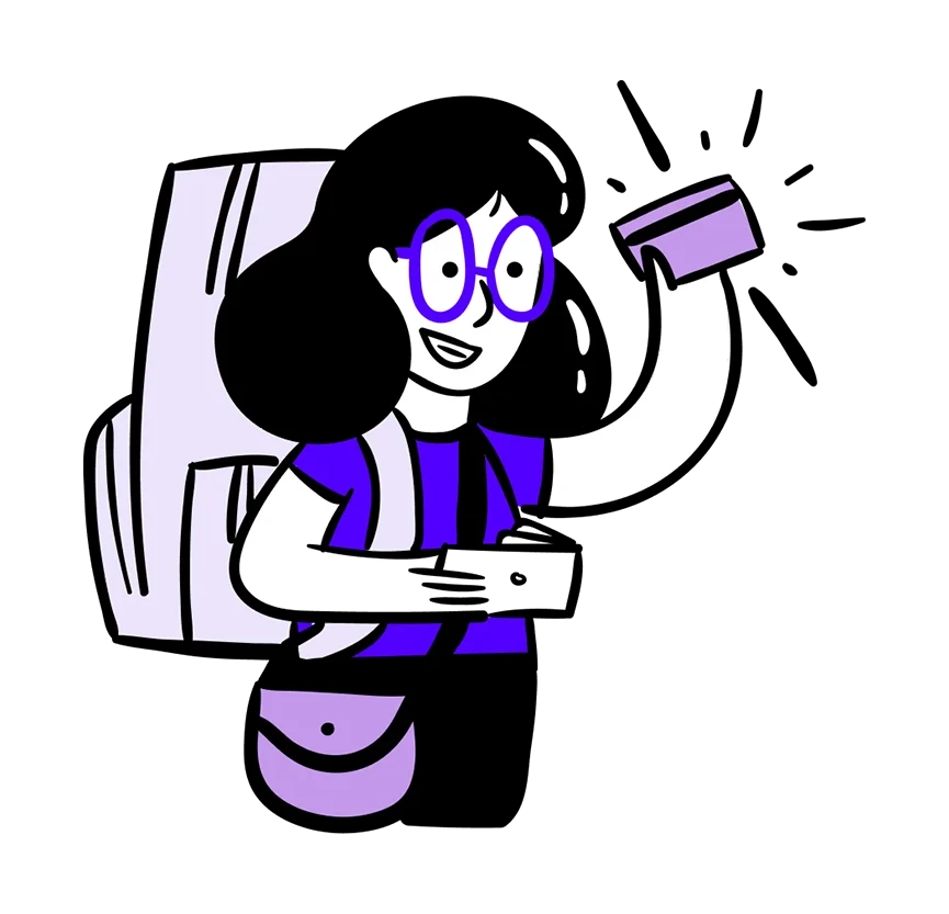
An image before the journey begins.
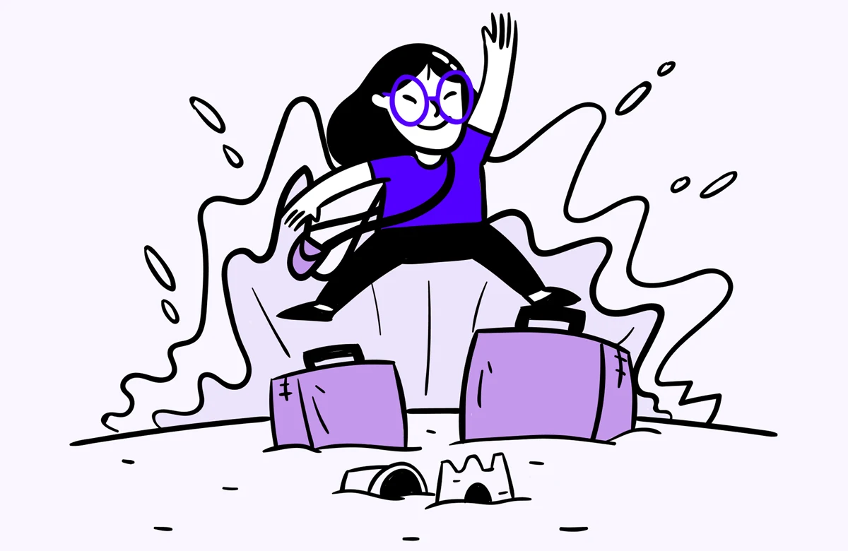
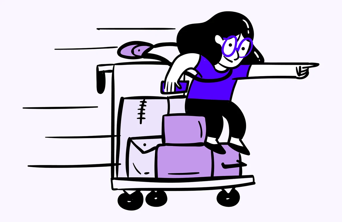
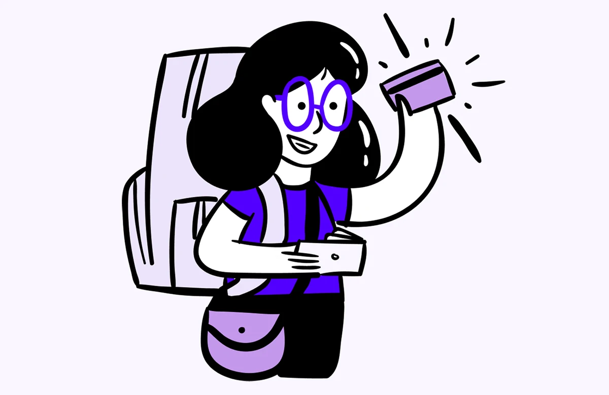
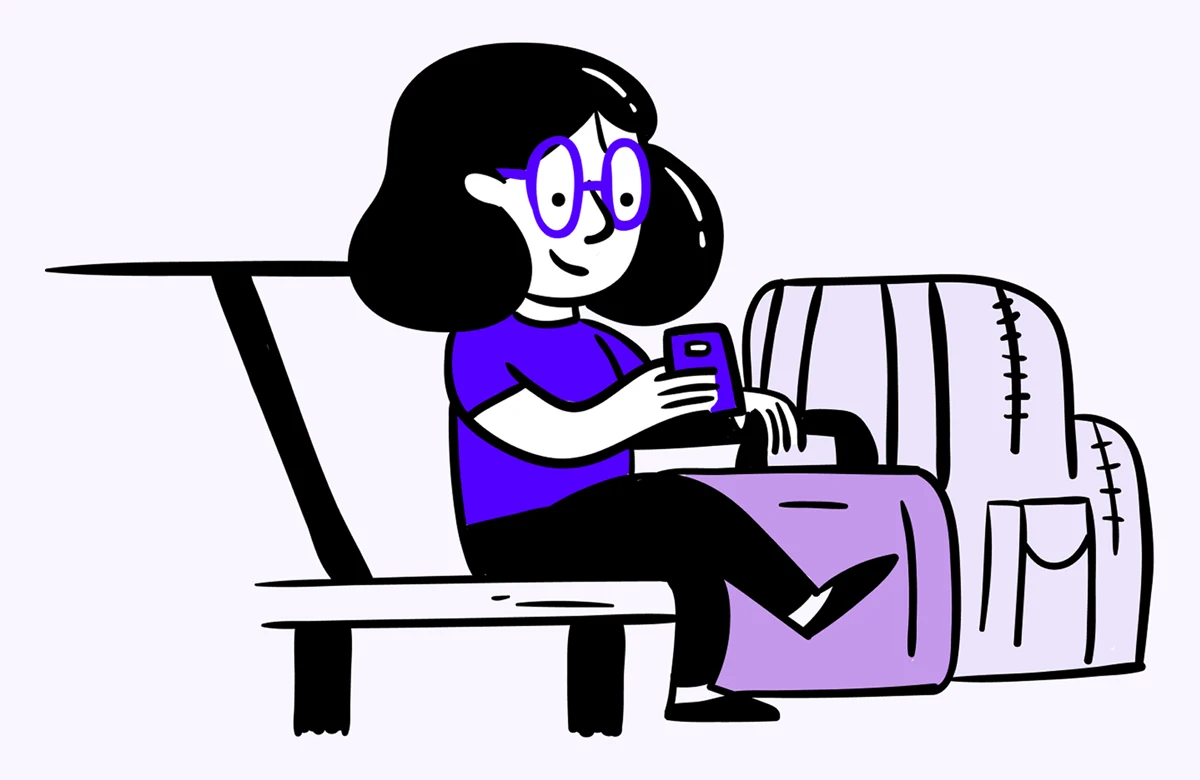
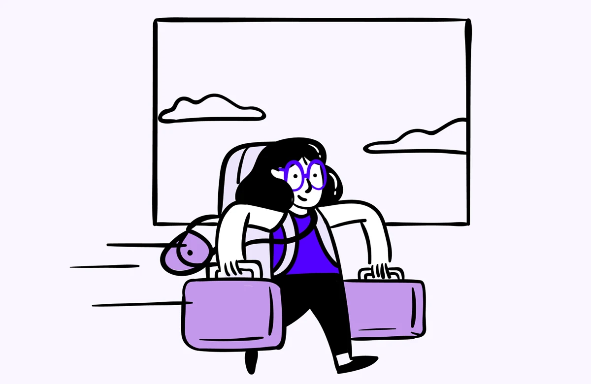
The brief was clear but demanding: make someone want to pack a bag. Skip the flights and rewards balances, and capture the sensation of being somewhere else instead: the weight of a full backpack, the anonymity of departure, the particular silence of a city you've never been to. Five pieces. Five moments. Each one a small argument for going.
Editorial voice, travel soul.
Most fintech illustration leans corporate: clean vectors, abstract graphs, optimistic figures in generic settings. Travel More needed something different, a visual identity that felt lived-in, like notes in a travel journal or a well-worn boarding pass. We started with pencil sketches, letting the line work stay loose and gestural, building each piece around a feeling rather than a destination: the anticipation of departure, the rhythm of being in motion, the reward of arrival somewhere new.
The palette pulled from golden-hour light and deep ocean blues, the two tones that show up in every trip worth taking. These illustrations were designed to do the same job as strong copy: make the product feel worth opening before a single feature is explained.

Your product,
built right.
Great products need a visual voice before the first user signs up. If you're building something worth traveling toward, we know how to make it look like it.