Case Study · Mental Health App Design
Mi Hope
A mental wellness app designed for people navigating recovery and emotional challenges, offering daily check-ins, crisis resources, guided routines, and mood tracking that meets users exactly where they are.
Design for people at their hardest moments.
People navigating recovery and mental health challenges needed a digital companion that felt warm and human, not clinical or overwhelming. Mi Hope was designed with one principle above all others: the user should always feel safer after opening the app than before.
Understanding Mi Hope
Mi Hope approached us with a mission-critical product: an app designed to support people navigating mental health challenges and addiction recovery. The design challenge was significant, these users are often in vulnerable states, requiring a UI that communicates warmth, safety, and clarity without ever feeling clinical or overwhelming.
Knowing Who We're Designing For
Before designing a single screen, we mapped the competitive landscape, segmented the user base, built personas, traced the user journey, and defined user stories, ensuring every design decision was grounded in the specific needs of people navigating recovery.
Mapping the Market
Existing apps focus either on meditation (Calm, Headspace) or professional therapy (BetterHelp), neither is designed specifically for the daily structure needs of recovery support.
| App | Mood Tracking | Crisis Resources | Recovery Tools | Community | Guided Routines |
|---|---|---|---|---|---|
| Calm | No | No | No | No | Yes |
| Headspace | Partial | No | No | No | Yes |
| BetterHelp | Partial | Partial | No | No | No |
| Woebot | Yes | Partial | Partial | No | No |
| Mi Hope | Yes | Yes | Yes | Yes | Yes |
Who Needs Mi Hope
Four user groups emerged with distinct needs: recovery support, ongoing mental health management, preventive wellness, and caregivers supporting loved ones through treatment.
18-45. Navigating addiction recovery or behavioral health programs. Need daily structure, accountability tools, and crisis resources within reach.
20-40. Managing diagnosed conditions independently or alongside therapy. Need mood tracking and symptom monitoring between sessions.
22-38. Building mental resilience before challenges arise. Want guided routines and emotional check-ins as a long-term healthy habit.
28-55. Supporting family members through recovery or treatment. Need educational content and communication tools to be effective advocates.
Designing for Real People
Three archetypes shaped from 18 user interviews and 210 survey responses, each representing a unique set of emotional needs the design had to meet with sensitivity and precision.
"Some days I just need to check in with how I am feeling, but opening a white clinical app makes me feel like I am at the doctor's office."
"I am two years into recovery and I still do not have a daily structure. I need something that keeps me accountable without feeling like homework."
"My daughter is in recovery and I need resources to understand what she's going through and how I can actually support her."
From Crisis to Consistency
The user journey for Mi Hope begins at a vulnerable moment and ends with an established daily practice. Every step was designed to reduce friction and build forward momentum.
- Step 01Trigger: A difficult momentUser faces a crisis, relapse risk, or high anxiety moment. They reach for their phone looking for something to ground them.Distressed
- Step 02Discovery: Finds Mi HopeUser discovers Mi Hope through a recommendation, online search, or program referral. The warm visual design signals safety before a word is read.Cautious
- Step 03Onboarding: Low-pressure entryShort 3-step onboarding captures user context without demanding deep disclosure. The app personalizes from day one without feeling intrusive.Open
- Step 04Daily check-in: Builds habitUnder 3 minutes. One question, one mood entry, one micro-task. The streak becomes a quiet source of pride and self-accountability.Engaged
- Step 05Progress: Patterns become visibleAfter two weeks, mood charts and milestone badges give the user tangible evidence of their progress. The data belongs to them, not an algorithm.Motivated
- Step 06Long-term: Mi Hope as a companionThe app transitions from a crisis tool to a trusted daily companion. Users report feeling more in control and less alone in their journey.Empowered
What Users Actually Need
Distilled from persona research and journey mapping, these stories defined the feature scope, ensuring the product delivered real support, not surface-level wellness theater.
- US-01 As a user in early recovery, I want a daily check-in ritual that takes under 3 minutes, so I can build a consistent habit without feeling overwhelmed.
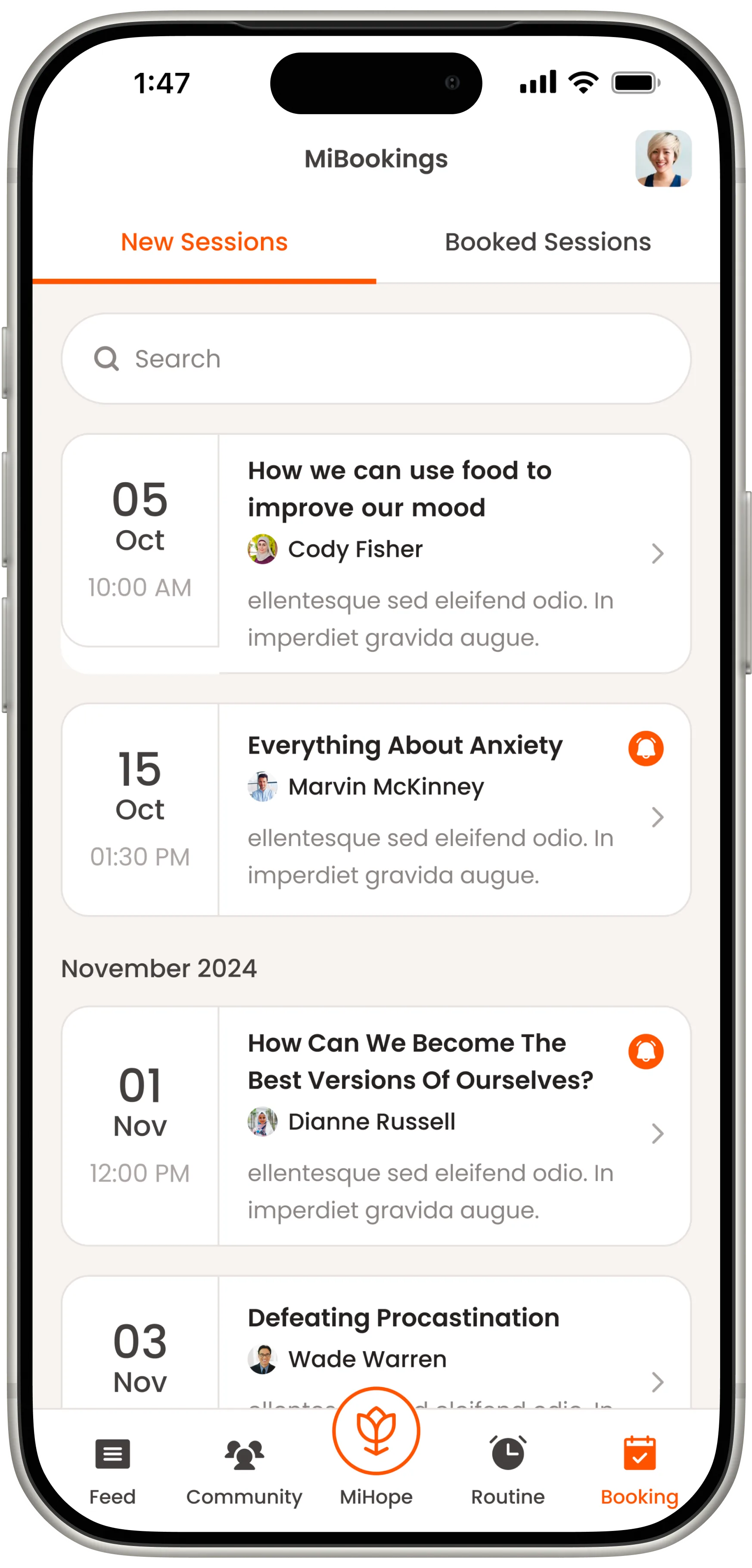
- US-02 As a user experiencing anxiety, I want breathing exercises and grounding techniques available from the home screen in one tap, so I can find relief immediately when I need it.
- US-03 As someone managing my mood long-term, I want to see patterns in my emotional state over weeks and months, so I can identify my triggers and share meaningful data with my therapist.
- US-04 As a user in a crisis moment, I want a single visible button that connects me to emergency resources and hotlines, so I never have to search for help when I am most vulnerable.
- US-05 As a long-term user, I want to see my recovery milestones and streaks celebrated in the app, so I have tangible proof of how far I have come on hard days.
- US-06 As a caregiver, I want curated educational content that explains what my loved one is experiencing, so I can provide informed support without accidentally causing harm.
Color, Type, and the Language of Healing
Colors and a strong style guide establish the visual identity of an app. For Mi Hope, we chose a warm amber-orange palette that communicates hope, energy, and human warmth, deliberately avoiding clinical blues and grays that carry associations users link to hospitals and institutions.
(600) HEX #E05A2B Accessibility: 3.7:1 AA grande
(900) HEX #7A1E08 Accessibility: 14.0:1 AAA
Texts HEX #24201F Accessibility: 18.0:1 AAA
(Warm 50) HEX #F7F4F1 Accessibility: 19.0:1 AAA
Where We Landed
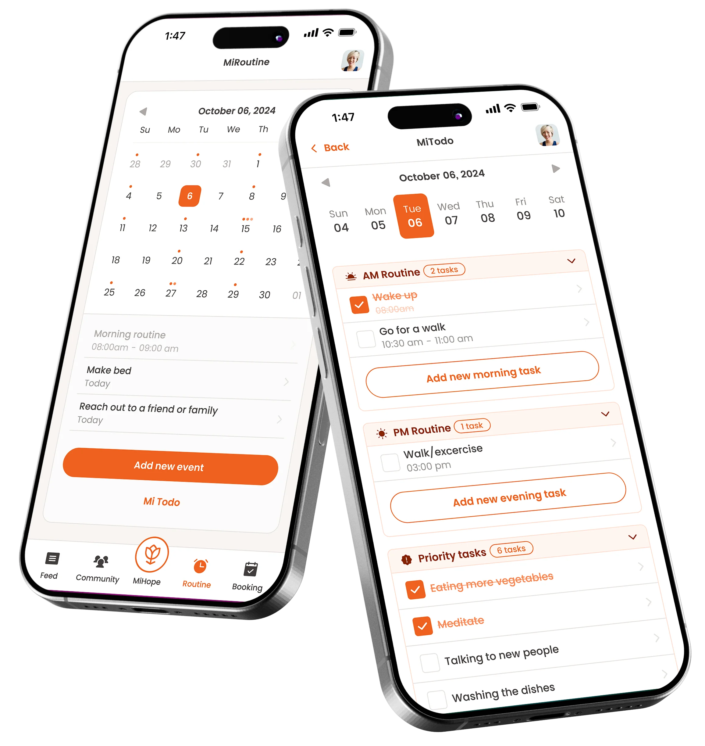
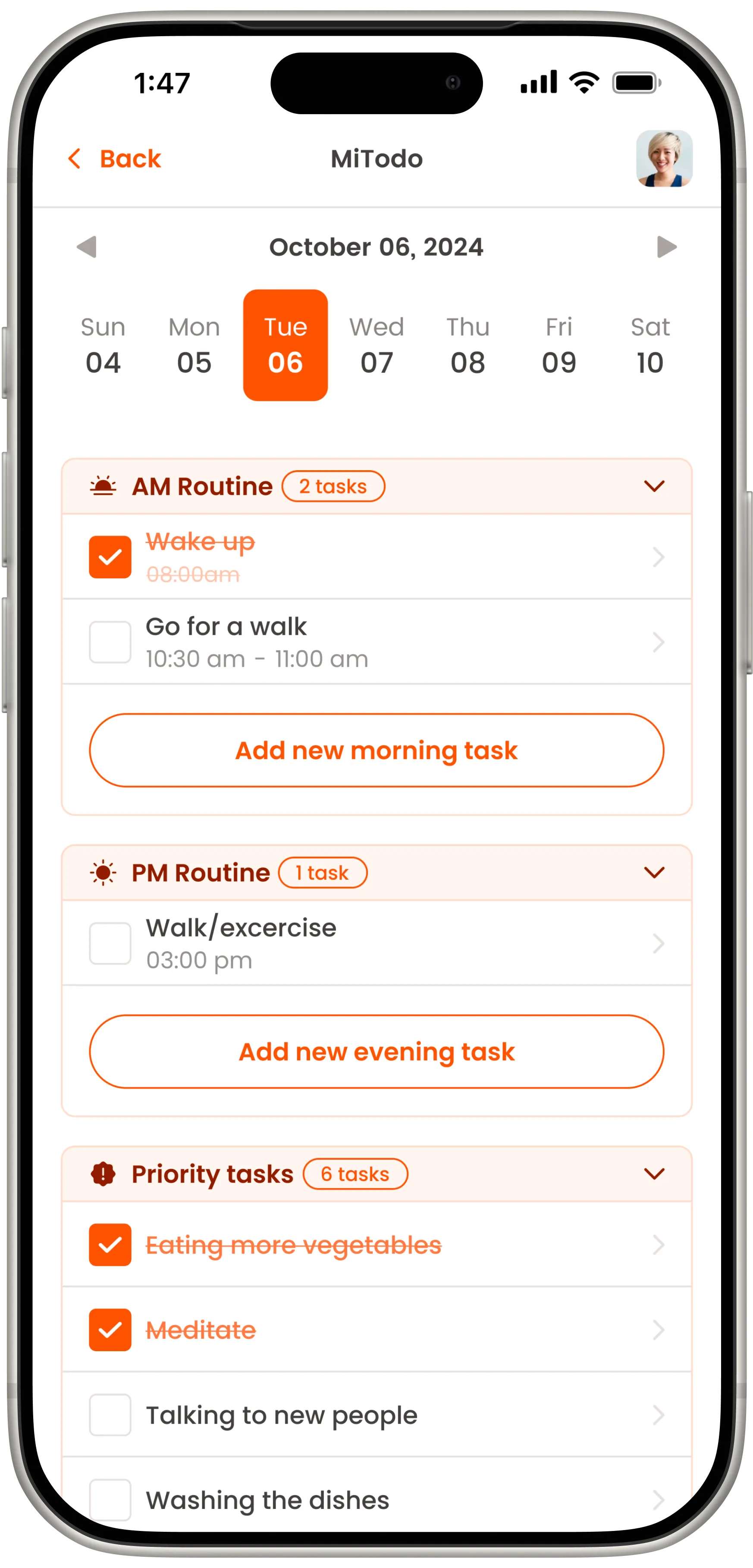
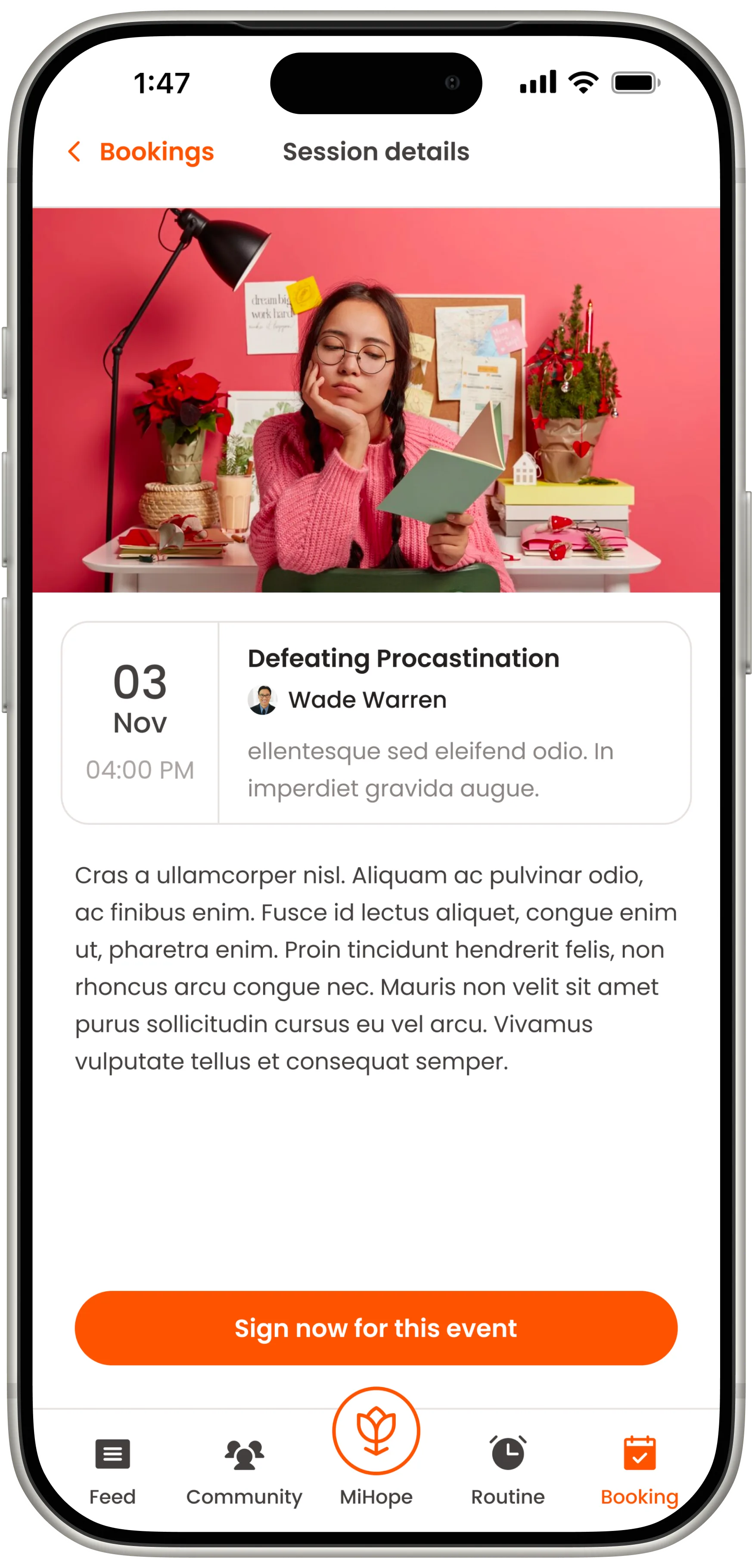
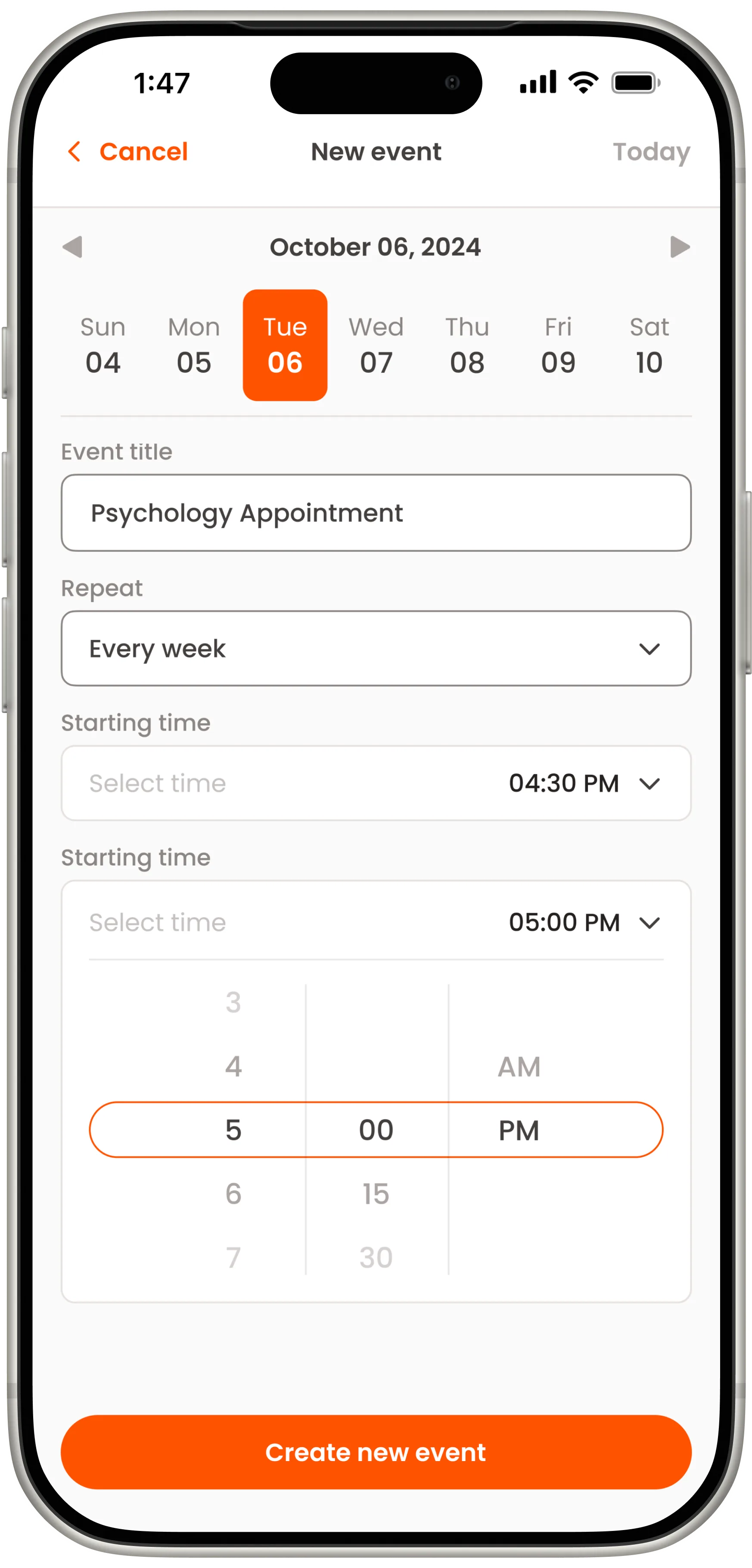
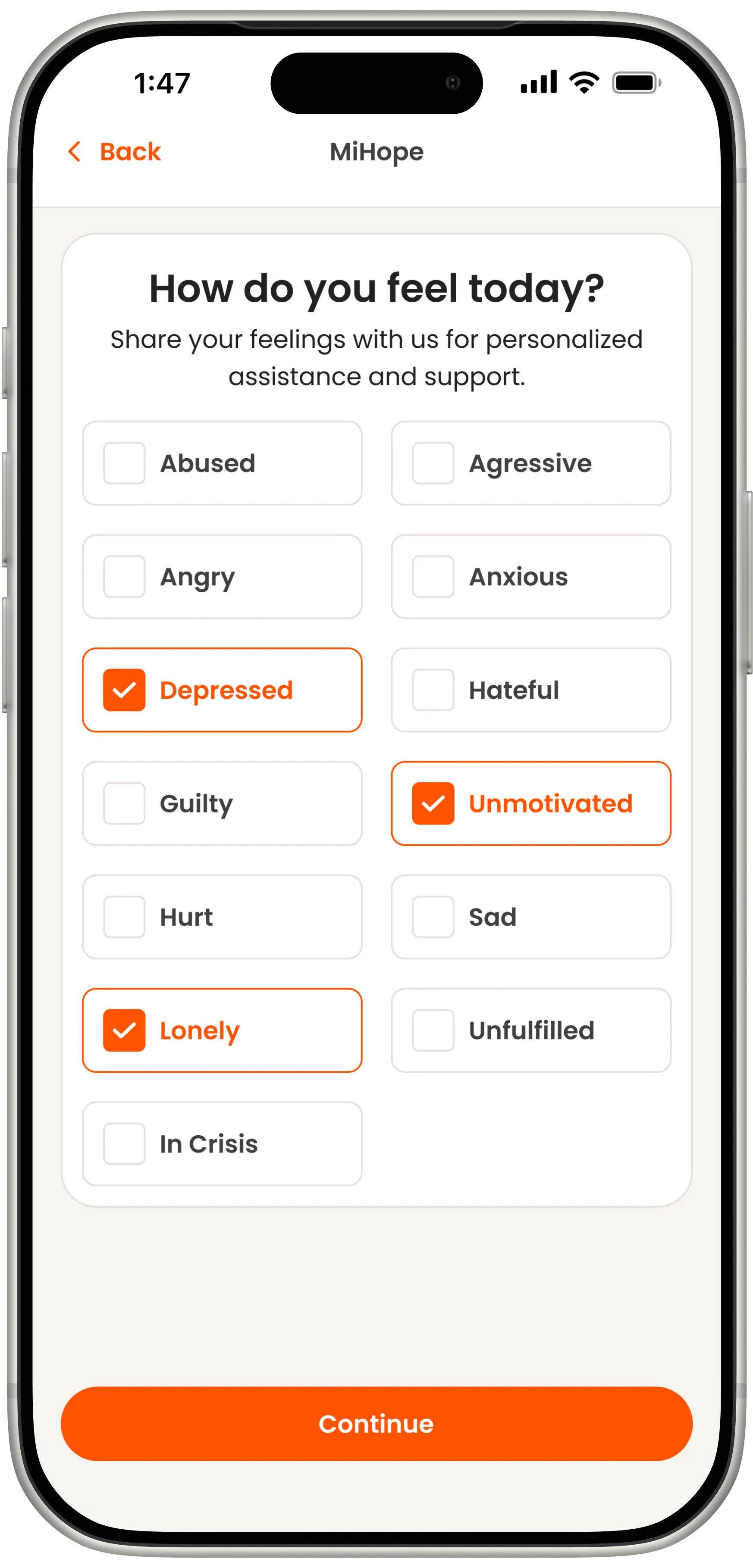
The core challenge was designing for a user who may be emotionally distressed while still needing to complete tasks. Every interaction was optimized for low-friction engagement, short steps, warm language, and consistent positive reinforcement that builds habit without creating pressure.

Your product,
built right.
Mi Hope showed that the hardest design problems are human first and technical second. If you're building a product where trust and emotional safety are the foundation, we'd love to work with you.